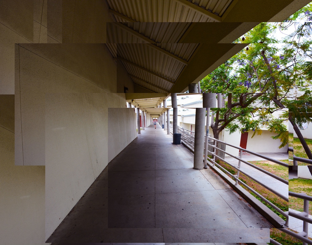
David Hockney Inspired Collage
Leading Line
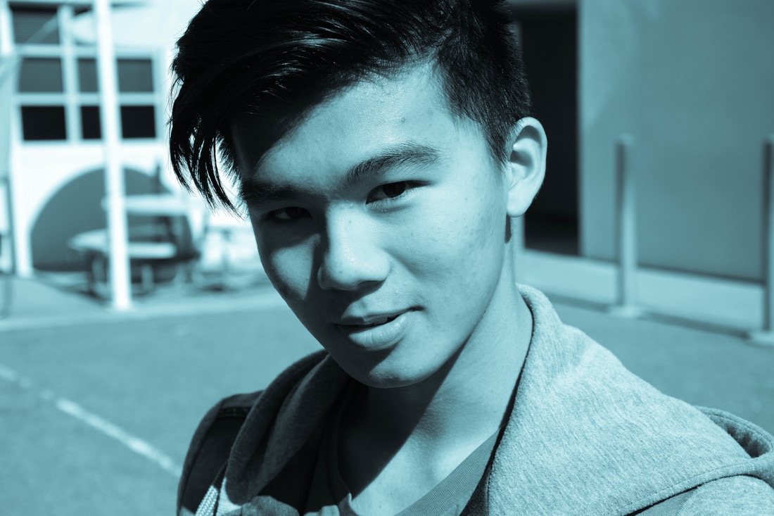
David Hockney is a British painter, printmaker, and photographer, who was a key figure and contributor to the Pop Art movement of the 1960's. He is considerably one of the most influential British artists of the 20th century. In terms of his photography, Hockney is most famed for his collages which he calls "joiners." Hockney's inspiration for creating these collages derives from his distaste towards distorted photographs taken with wide lenses. So in order to fix this Hockney would take multiple polaroid shots of a subject from different angles and times, and then glue them together. Because each photo in the collage differs from the rest in terms of light and perspective, the resulting work has an affinity with Cubism; as emulated above.
In order to mimic Hockney's style I simply layered different photos shot from slightly different angles in photoshop. In the first photograph especially I made sure to align certain angles and features of select photos, while also preserving the organized mess produced by the rectangular edge of each layered photo.
In order to mimic Hockney's style I simply layered different photos shot from slightly different angles in photoshop. In the first photograph especially I made sure to align certain angles and features of select photos, while also preserving the organized mess produced by the rectangular edge of each layered photo.
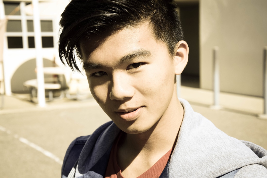
Magazine Cover
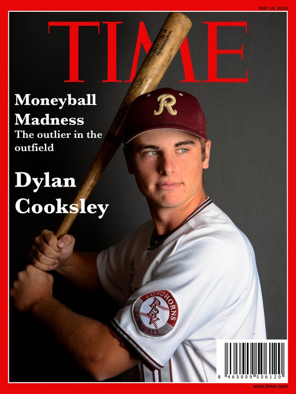
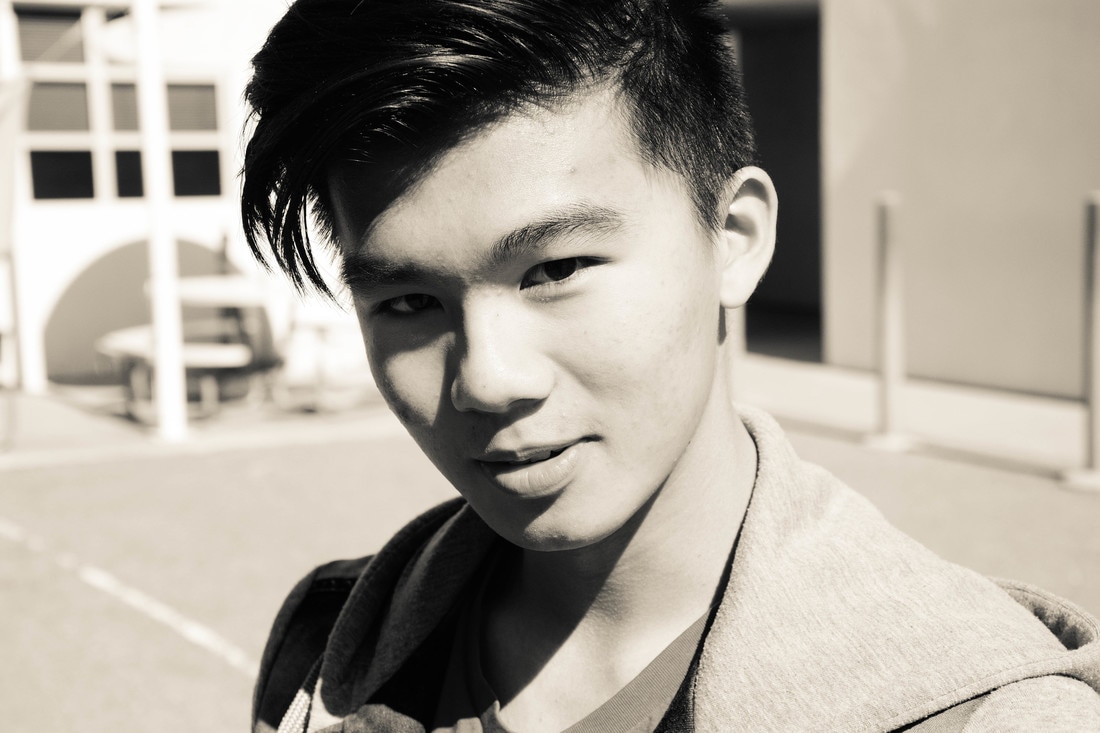
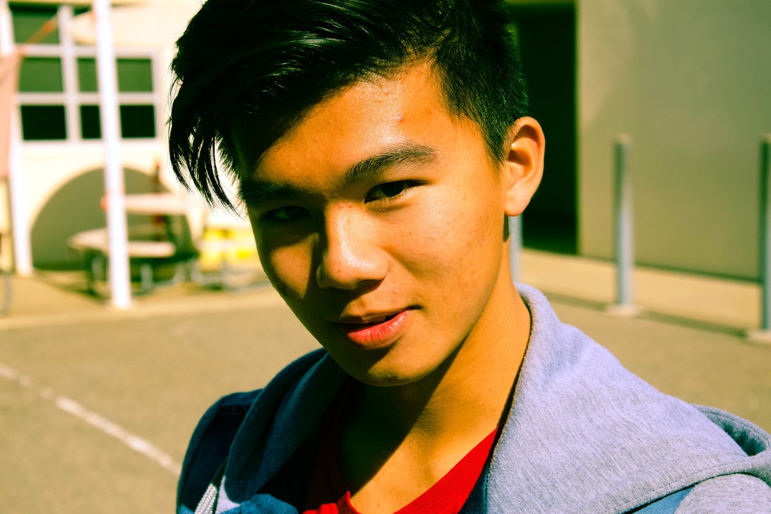
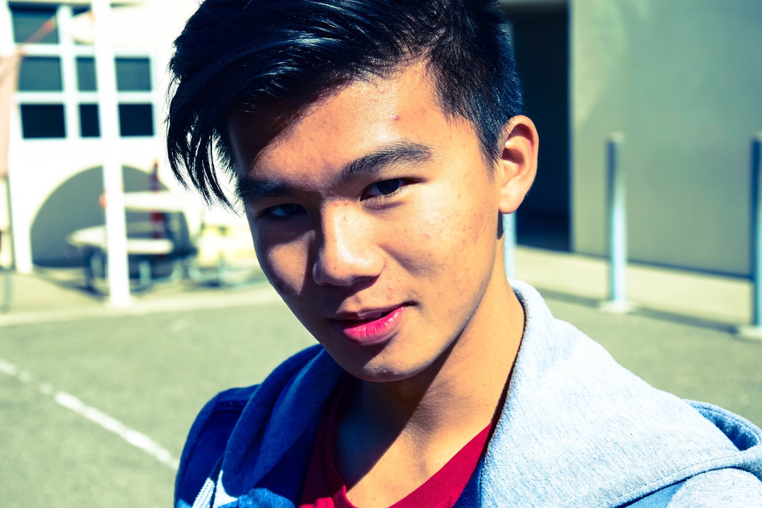
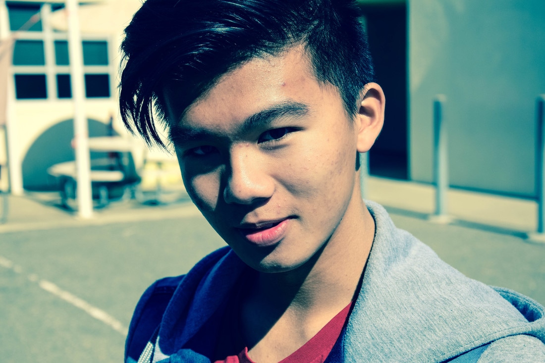
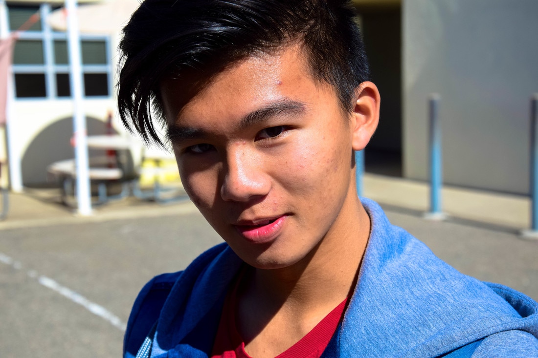
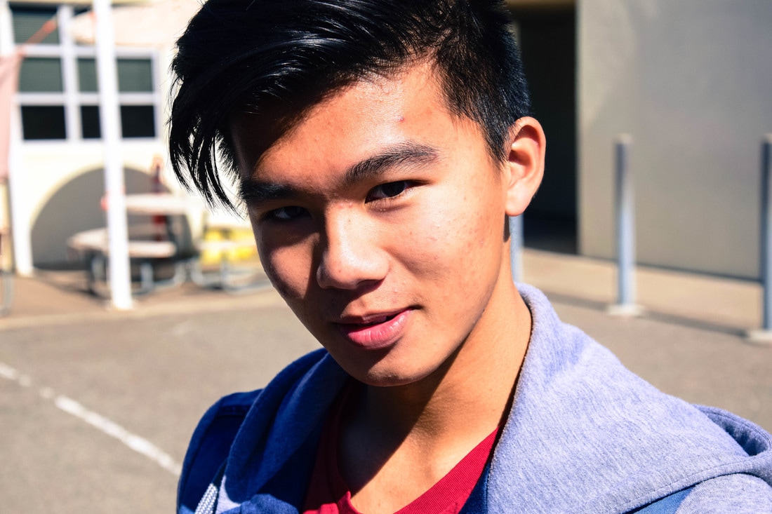
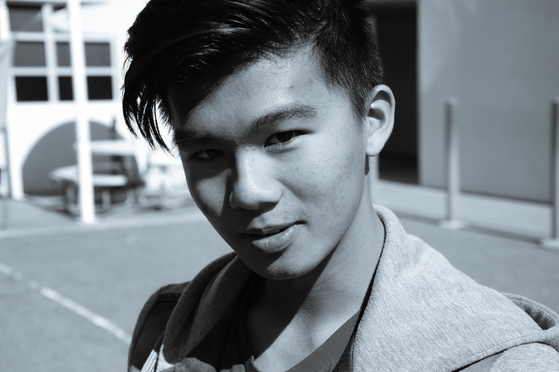
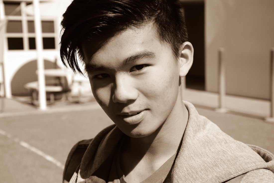
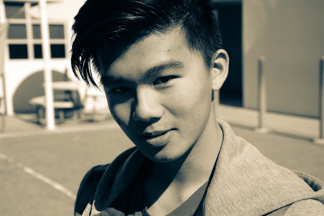
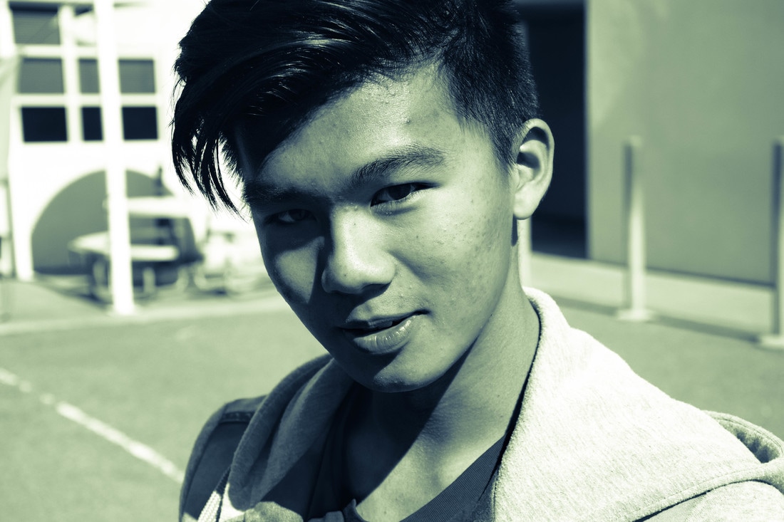
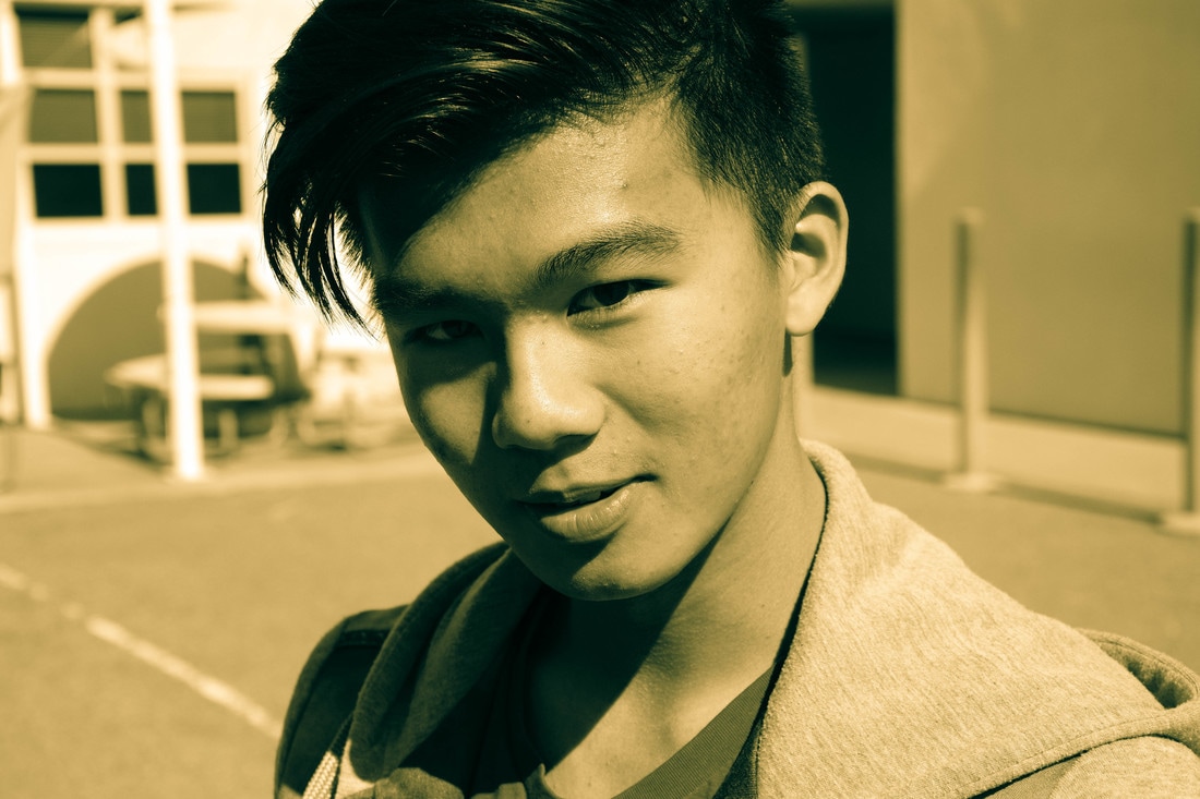
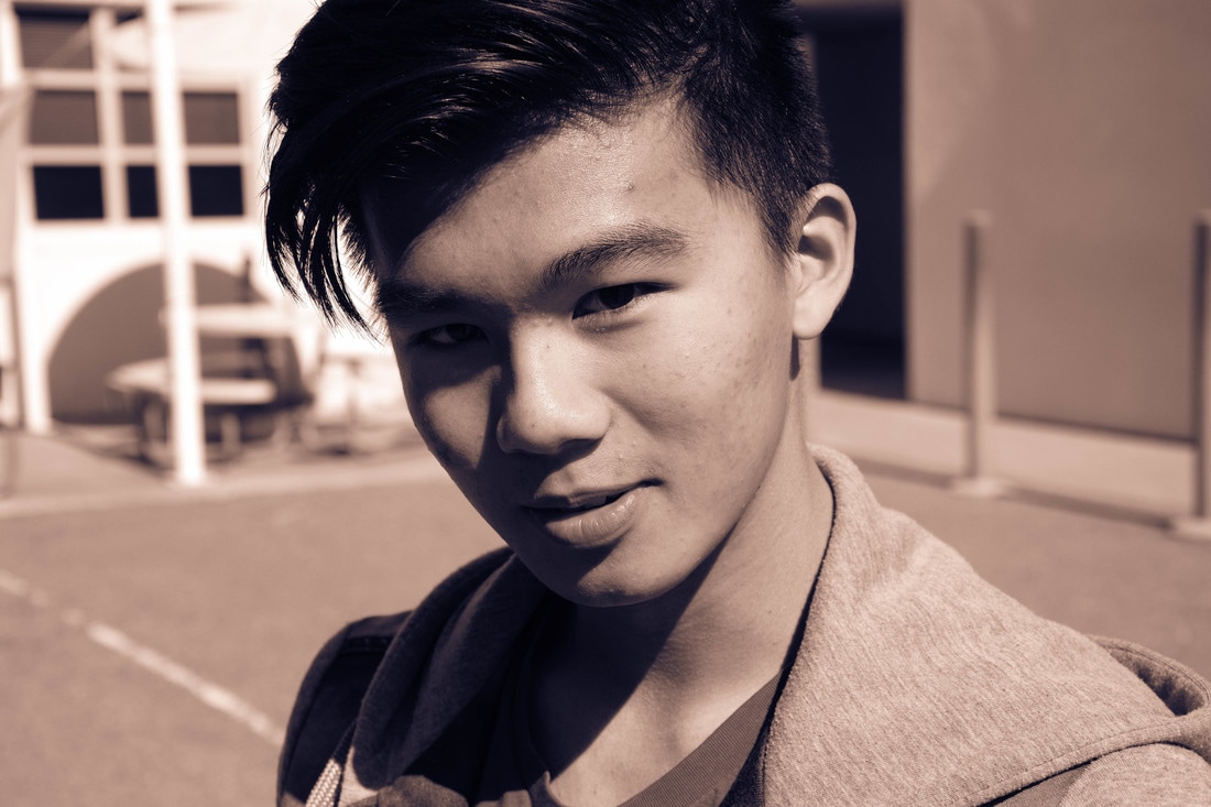
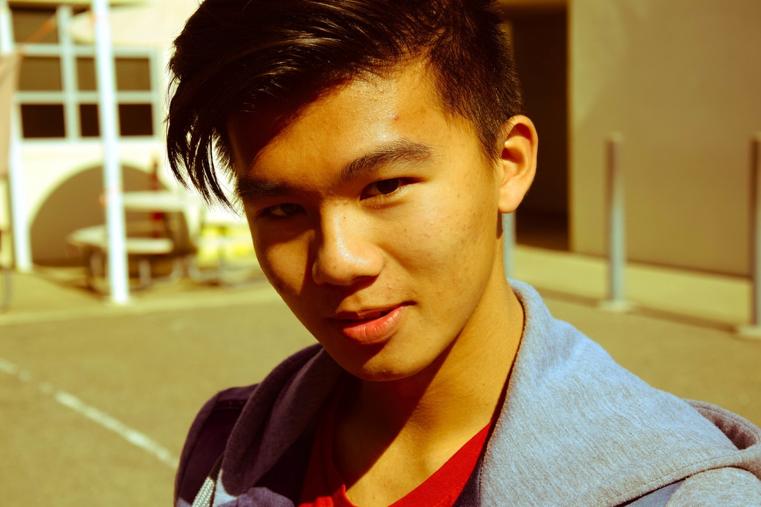
In this project the objective was to take a photo with studio lighting and then use that photo to emulate a magazine cover. I chose to do a Time magazine cover because it's a timeless design (no pun intended), and the formatting is simple yet sophisticated. I used Baskerville Semibold for the text in white and Franklin Gothic Medium for the date and website written in black, which is typical for Time.
My setup included a soft grey background, a strobe light that was placed to the right of the subject in order to get a contrasting shadow, a softbox, and Jared holding a reflector to the left of Dylan to mitigate the direct light. The studio strobe, which is a large light that is powered with AC power, was very useful since they have relatively fast recycle times. This allowed me to take multiple photos in succession without having to worry about the flash lagging. The radio trigger system also helped minimize the flash recycle time since it provided instant relay.
I originally used a modeling light, which is a wand-like flashlight that provides constant illumination. However, I found the light too intense so I decided no to use it. I also used a soft box to diffuse the light and reduce the harsh shadows. It took multiple trials but I eventually placed the softbox just right so I could define the creases in Dylan's shirt without having too much contrast. I used a grey card in order to test the different levels of light and adjust the soft box accordingly.
Del Mar Fair
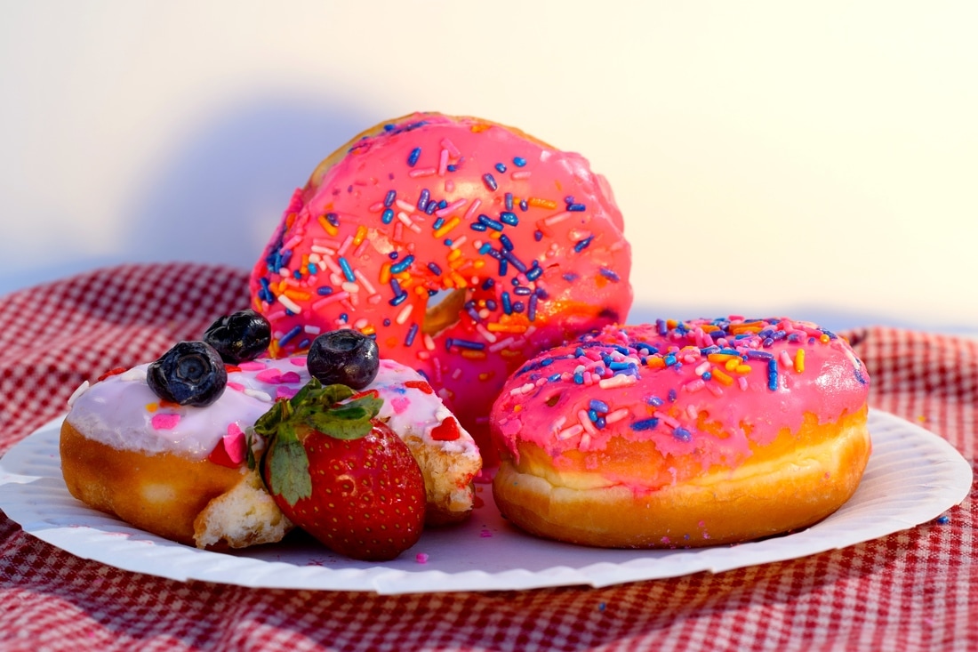
Decadent Debauchery
My photograph titled “Decadent Debauchery” was a photo I took at my high school as part of a photography project in which we focused on food photography. I placed one donut standing upright with two donuts lying flat in the foreground to create a sense of symmetry among the subjects that would be visually pleasing to the viewer. The symmetrical placement of the donuts also establishes unity among the subjects so that the viewer focuses on all three donuts as one meal, therefore instilling a desired sense of hunger and gluttony. I also used a warm reflector to highlight the glistening frosting and to accentuate the overall color. To emphasize the color further I used iPhoto to saturate the photo slightly in order to make the donuts appear more appealing. I then used Adobe Photoshop to crop the image and adjust the resolution prior to printing to assure maximum quality for the print. I shot this photo with a Nikon D5300 with an 18-140mm lens and printed it on Epson Glossy Photo Paper on an Epson P800 digital printer. I submitted this photo to Division 4701 (Color Photography) because I think it features exuberant color and a keen sense of unity.
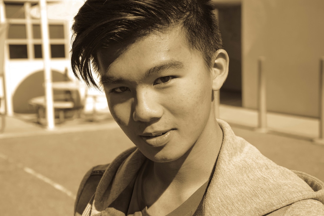
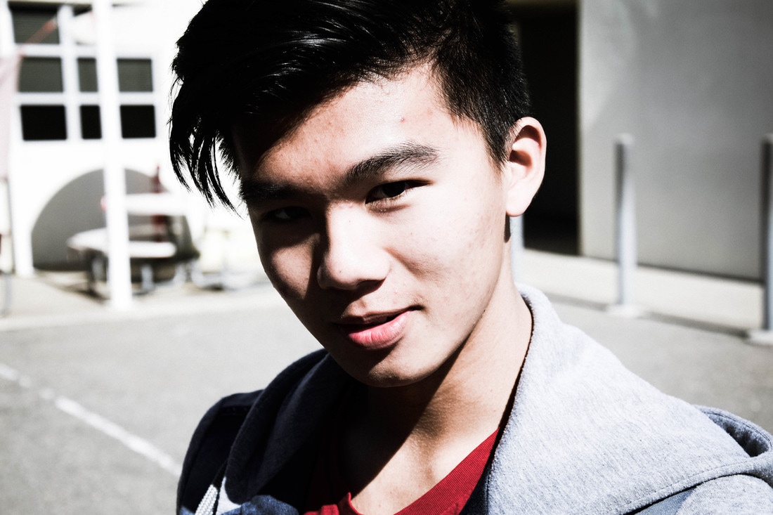
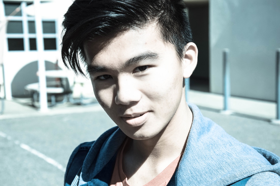
Lightroom Presets

Sports
Mood Portraits
Composite Photograph
...I shall be telling this with a sigh
Somewhere ages and ages hence:
Two roads diverged in a wood, and I--
I took the one less traveled by,
And that has made all the difference.-Robert Frost
Somewhere ages and ages hence:
Two roads diverged in a wood, and I--
I took the one less traveled by,
And that has made all the difference.-Robert Frost
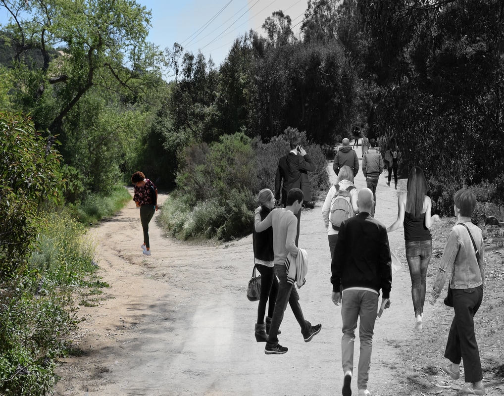
In this project the objective was to allude to a song/poem by visually symbolizing its overall message through layering multiple photos in order to create a fantasy like image. A lot of what is featured in the photo above is the contrast in color and multiple layer masks. I realized that since my photo features elements of leading line I would need to scale the individuals walking on the path to the right in order to create a sense of depth perception. I had merged all the layers in the black and white portion of the photo so I needed to add a background layer of the two paths in color and then do a layer mask in order to make the left portion of the photo have color. The purpose of this contrast is to illustrate the "black and white" mindset of the average person whereas someone who has a curiosity for the unknown and goes against the tide will likely have a more colorful frame of mind.
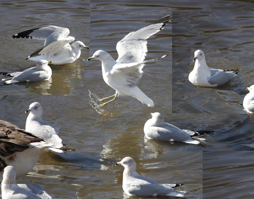
Flying
Tessellations
In this project the objective was to transfigure a selection of six photos into tessellations. A tessellation is an art form in which the artist takes a fragment of a photo, pattern, or surface and arranges it into a geometric pattern that exhibits symmetry and the use of a motif in some cases. I was able to imitate this art form by using Photoshop. I first made a new file on which to set equal margins in order to achieve a symmetrical effect. I then selected a photo to put into Photoshop, used the rectangular marquee tool to select a portion of the photo, used the move tool to move it on to the file I had created, and then copied the layer multiple times and arranged it in a symmetrical fashion. It is important to note that a square tessellation is achieved best when using proportions such as 2x2, 4x4, 8x8 and so on. I really enjoyed this project because it was altogether satisfying to arrange the photos in patterns as seen above. My favorite image would have to be the last last one featuring the yellow flower. I think it would look nice as a floral pattern on an article of clothing such as a dress or tank top. At first I struggled with the formatting of the photo in order to achieve symmetry but then by flipping in vertically and horizontally i was able to achieve the desired pattern. I would definitely do this again if I had the time. It's like crafting your own little puzzle. I would probably select better photos, however, if i were to attempt this again.
Portraiture
By going to the duckpond and engaging in portraiture I learned that lighting plays a huge factor in emphasizing color, contrast, and subject focus. At first I was hesitant to utilize the reflector because I was afraid that there would be little to no shadow development, but after using it I was pleased to find a balance in light concentration as well as an overall warmer image. I also learned that the movement and turbulence of a photo depends greatly on the subject's pose as well as the cropping of the image. As I was editing these photographs in Photoshop I focused primarily on my subjects facial area and "smoothed" it over using surface blur as to remove any outstanding blemishes or imperfections. I am grateful for this experience because it has made me more qualified for careers such as photojournalism and wedding photography as well as photo editing and studio photography.
Reach for The Skies
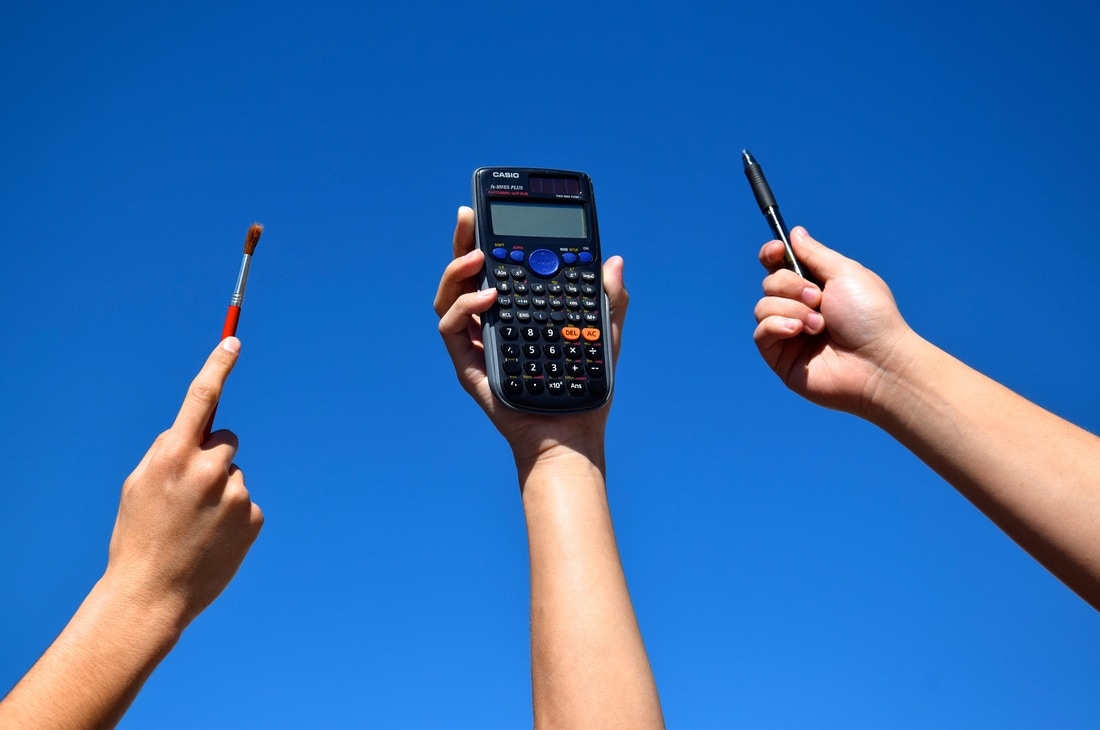
Reach for The Skies
Education, to me, is not the regurgitation of information. Nor is it the memorization of a mechanical process. It is the product of passion and ambition. By placing a pen, paintbrush, and calculator in a symmetrical fashion I suggest that the three subjects are equal. Whether one wants to be an artist or a mathematician the sky’s the limit. Nowadays aspiring artists are often discouraged from reaching their true potential because of the fear that their art will not be profitable. So instead they apply themselves to what they think are more “utilitarian” subjects such as math or computer science. This simply isn’t true. A fervent desire for knowledge is often accompanied by artistic taste and attention to detail; regardless of your career. Therefore an artist and an engineer are equally important. In my experience, California’s educational system has proven to be diverse. No subject is superior to the next; however, the best subject is one where you always learn something new, no matter how long you study it. For the greatest teacher is an eternal student.
Food Photography
Midyear Gallery
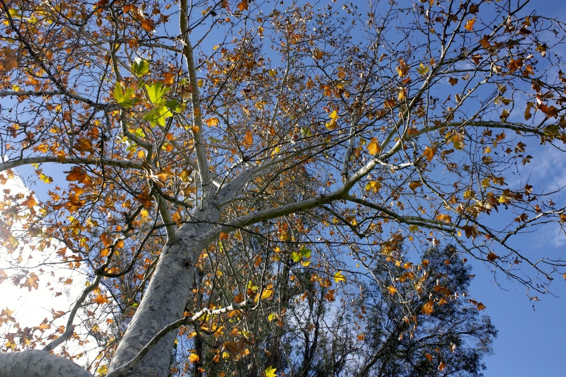
Autumn Daydreams
I chose the title Autumn Daydreams because I pictured myself laying on the grass looking up at the tree lost in a daydream and being lost in the many leaves, nooks, and crannies of the tree above. I used iphoto to adjust the lighting and saturation slightly as to emphasize the contrast between the blue sky and the orange leaves. I like this photo because it reminds me of my friendship with my best friend Ryan because this is one of the photos I took when he was showing me the ropes of photography.
Name Project
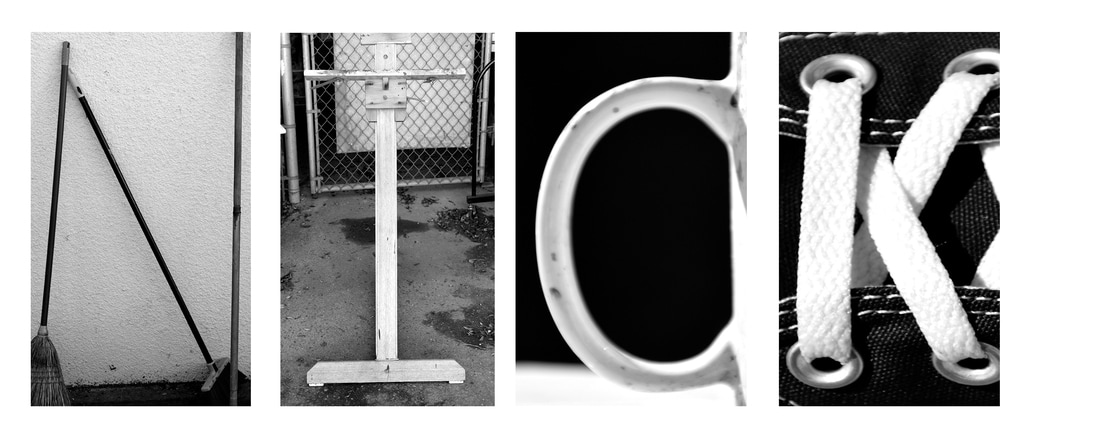
In this photo I took photos of objects that imitate alphabetical structure in order to spell my name. In order to do so I used photoshop to put each image on a grid as to properly space and format the photos to give it altogether unity. I used the transformation setting on each photo to properly scale and crop each photo as to emphasize each letter I was trying to imitate. I was a bit confused as to how I could focus a photo as seen with the slightly blurry 'C' and how to edit the grid to my favor. However, I was proud of how I achieved clear and aesthetically pleasing photos for the alphabetical constituents of my name. I probably could have cropped the photos more precisely as to not leave any ambiguity on what letter is which.
Rainy Day
Layer Mask
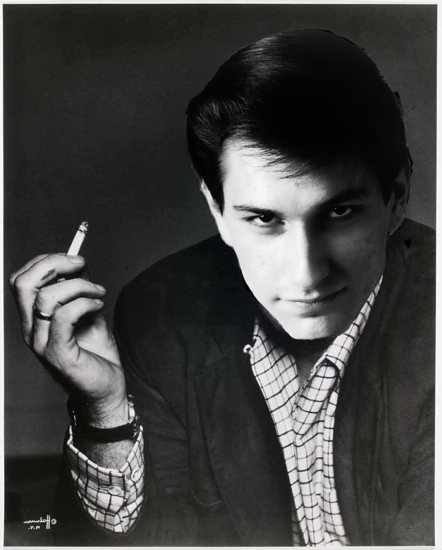
In this Photo I am portraying my dream job of being a writer in ten years. I used a photo of John Steinbeck as my background template and used photoshop to make it appear as if I am Steinbeck or rather that I aspire to be in similar light. It was suggested that I would use a black and white photograph since color photography was at a premium in Steinbeck's time. Because of this the use of light and contrast is emphasized in this picture and it appears to be "deeper" I suppose or perhaps imitates a vintage look.
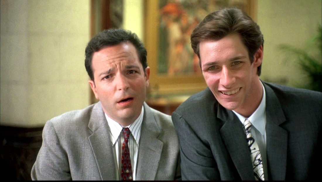
In this Layer Mask I used photoshop to give the impression that I am Jim Carrey or rather I am playing his role in this screen cap. In order to achieve this effect I used the lasso tool to drag my face onto Jim's and then by adjusting the color balance and contrast was able to imitate Jim's skin tone in order to make it appear more realistic. The magnifying tool proved to be a critical and by its utilization I was able to shave off edges more accurately and efficiently. I also flipped the image of my face horizontally in order to imitate the direction of lighting in the room and also fit Jim's hairline more precisely.
